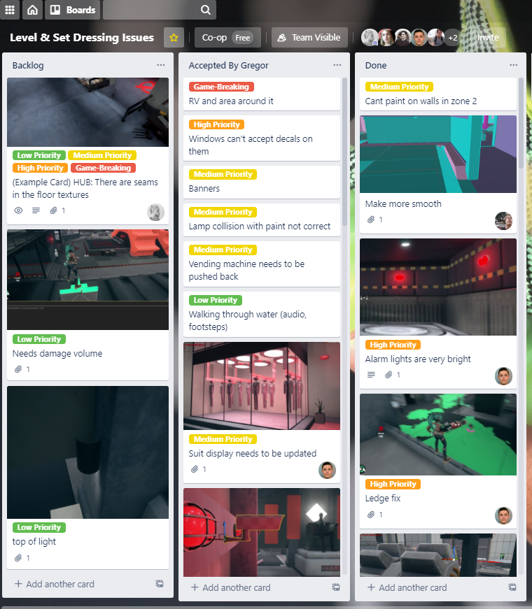
Check it out on Steam!

Project Information

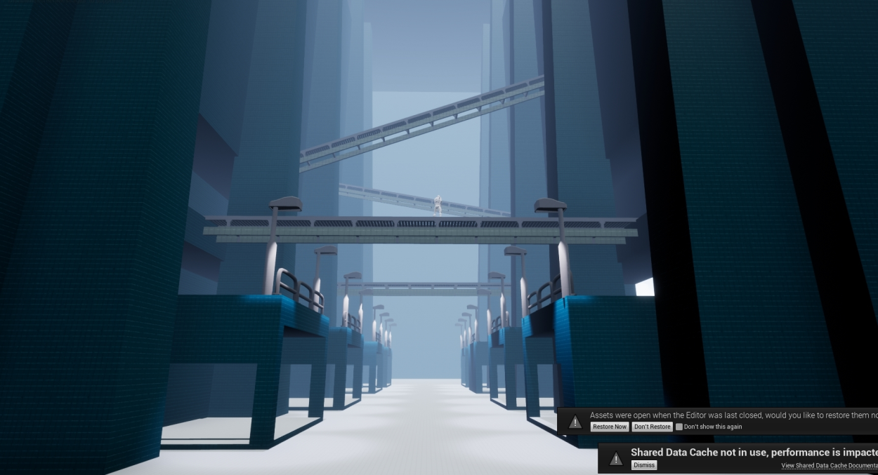
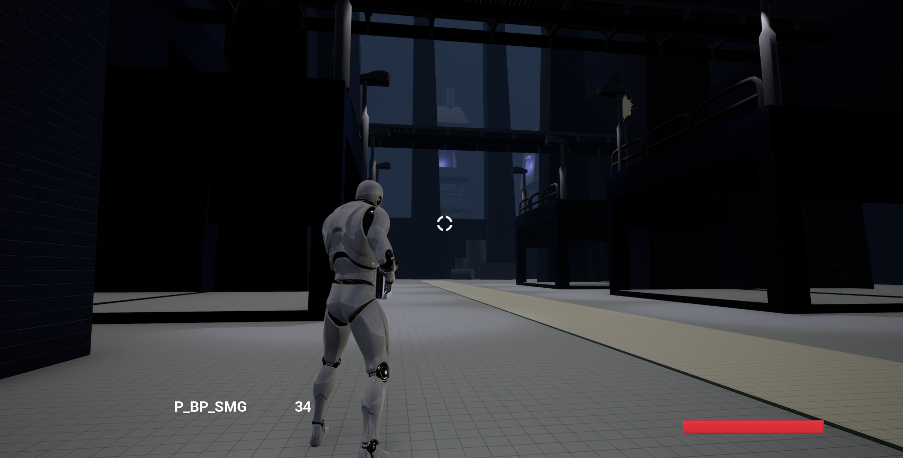
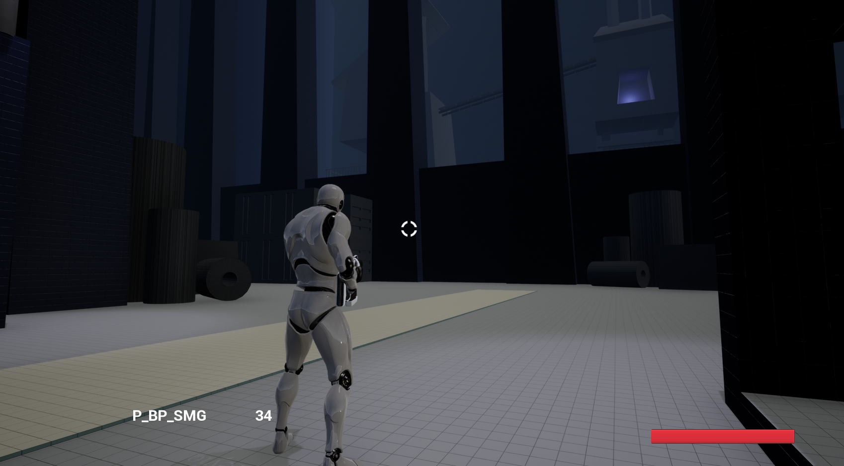
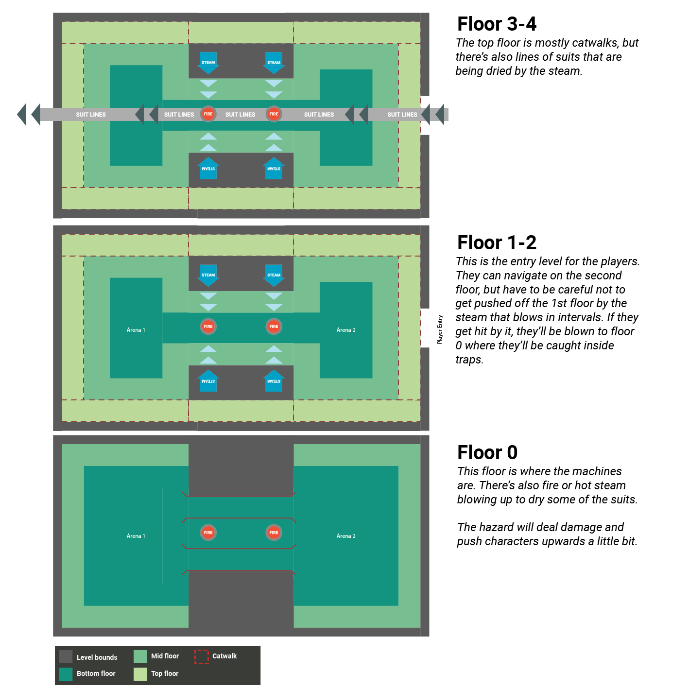
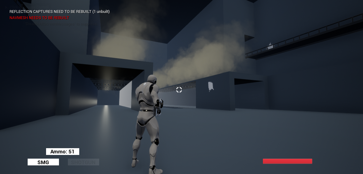
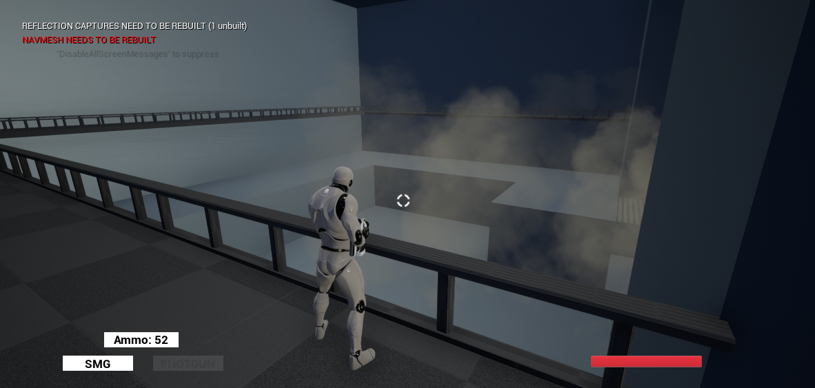
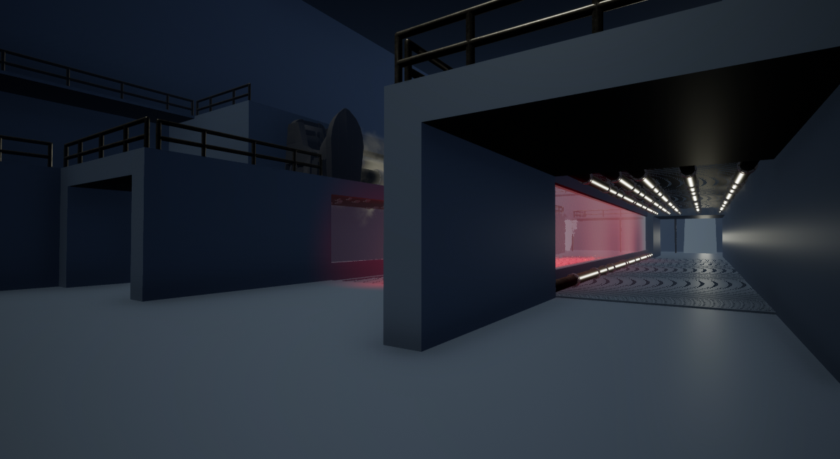
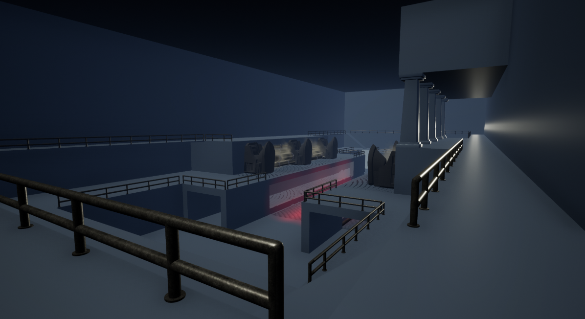
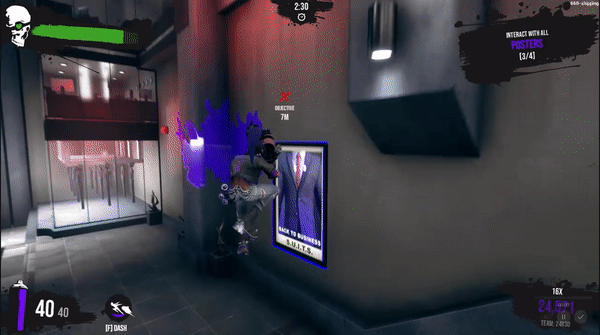
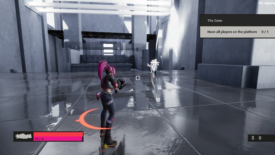
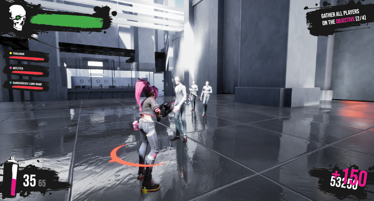
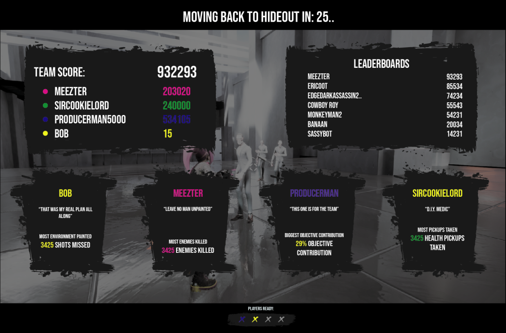
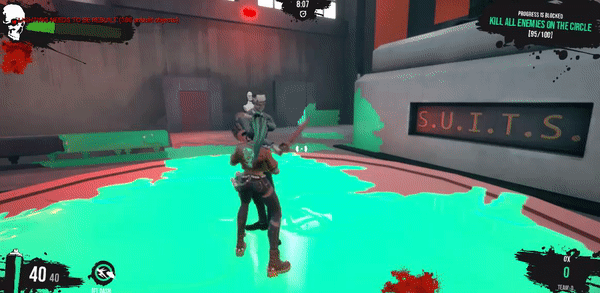
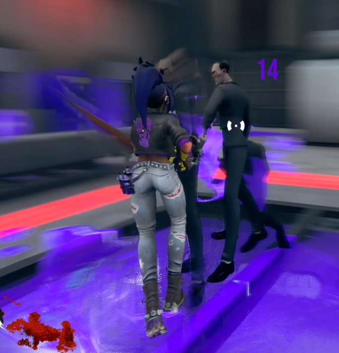
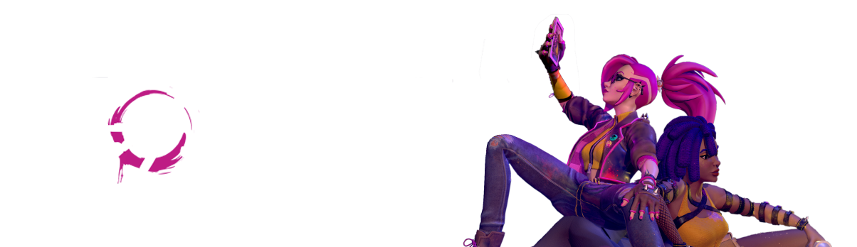
In this cooperative third-person shooter, you take control of the P.U.N.K.’s. Rebels that fight their way through an evil corporation with high-powered paint blasters. Sabotage the tyrannical corporation and fight the hordes of SUIT’s that try to stop you. Blast your way through their factory and complete objectives to achieve the highest chaos score!

MY ROLE WITHIN THE PROJECT: Design Lead, Level Design, UI/UX

PLATFORM: Steam, PC

DEVELOPMENT TIME: 1-year educational project

TEAM SIZE : 25

 ENGINE: Unreal Engine 

My Work In The Project

Game Design

After a rocky start in the development of this project, eventually, I had to make the call at one point to cut a lot of the features and come up with some creative solutions to our existing problems:

      • Each co-op player would have their own colour variation and their own paint colour. This came with quite a few benefits:
        • The character artists did not need to create different models, but four colour variations on the existing player character model
        • Players could see in-game which colours their friends were using
        • Players could identify their friends by colour, instead of names, which I could use later when creating more of the interface
        • Because every player had their own colour and after a played session, the factory would turn into the colourful esthetic of the rebels
      • A 10-minute timer would be the fixed duration of a play-session. Players would have to get the highest score possible.
        • A 10-minute play session would help us figure out where the biggest issues of our game would be, giving the design team a much-needed focus in the project
        • An arcade-style co-op shooter would be a relatively easy direction for us to take as we were running up against deadlines
        • The biggest risk here was that it needed to be very satisfying to score points. If it wouldn’t be juicy, it would probably not be fun.

Level Design

Over the course of the project, I’ve made multiple levels to get the level design vision out there. I started from sketches on paper to rough blockouts when our gameplay wasn’t certain yet. In the final weeks, I changed that from paper sketches to Adobe Illustrator sketches. I turned those into a blockout and playtested those levels.

One-pagers

To protect the project from feature creep in a bigger team, I set up some rules. Nothing would go in the project unless it was communicated through a one-pager. It also made it very approachable for peers to properly communicate their ideas and created a filter for feature creep. One-pagers are an efficient way of communicating, depending on your intent. I set up the format for the rest of the designers to follow and also made several one-pagers myself. They had a few requirements;

      • Description: What is the feature/proposal/idea?
      • What does it fix or add to the project?
      • Pro’s and Con’s of the feature/proposal/idea
      • A possible scenario and if possible, supporting images

UI/UX

I took on the task to overhaul our HUD and make it match our PUNK characters. I also took the liberty to include some small upgrades and polish features such as the spray can that indicates your ammo from a glance and an animated health bar, giving a less static feeling to the HUD.

An issue with the HUD was that a lot of the information had to be networked. We had colours that properly needed to be synced, scores that had to be correct for everyone and more importantly, the multipliers for the scores had to be correct. Together with the programming team, we made sure all this information was correctly synced.

While I picked up the tasks for the HUD, I noticed that it wasn’t just this that needed improvement. I also created and implemented:

  • Objective markers
  • Floating Score when enemies are defeated
  • An interactive Crosshair, that shows your dash cooldown
  • Objective menus, in-game menus
  • Interact buttons
  • Ammo bars, score bars and the dash cooldown
  • Post-game screen

Game Testing, Goal Making, QA

To keep our priorities on-track, I playtested often. I often took notes during playtests and turn those into action points. Those would be turned into tasks which I would order with the MoSCoW-method. The highest priority tasks would be turned in to the scrum masters which would decide how much of these tasks they could actually complete. Because we playtested a few times per week the priorities would become clear to us, knowing that we are on the right track, especially when the feedback would be repeated over multiple playtesters.

Skull Logo

We’d need a logo for the game and for the PUNKs. I took up this task and made some logos and iterations outside of regular hours. Eventually, I ended up with a stylized, stencil skull with an eyepatch. The heart eyepatch would reference the dangerous side of the PUNKs, while the heart resembles our main character, Diva. This asset I also used for the health bar and can also be seen on the back of the player models.